Updated: March 17, 2026 By: Marios
You have roughly 50 milliseconds to make a first impression before a visitor decides to stay or leave. That’s not enough time to read a headline, let alone evaluate your products. It’s only enough time for the brain to react to what it sees and feels.
Yet many ecommerce sites still pack their landing pages with pop-ups, competing CTAs, dense navigation menus, and walls of promotional text. The result? Visitors feel overwhelmed, trust erodes, and potential sales vanish. The irony is that trying to show everything at once often leads to selling nothing.
Streamlined UX, a user experience that removes friction and clearly guides visitors toward action, is one of the most reliable levers for driving conversions. A widely cited Forrester study estimates that every $1 invested in UX returns roughly $100, a 9,900% ROI. The brands that get this right see the impact directly in their revenue.
So, what separates a cluttered site from a converting one? Let’s break it down.
Why Clutter Kills Conversions
Cognitive load is the amount of mental effort required to process information. When a landing page bombards visitors with too many choices, too much text, or too many visual stimuli, cognitive load spikes while decision-making stalls.
This is known as decision fatigue. Research consistently shows that when people are presented with too many options, they’re less likely to choose any of them. For ecommerce, this translates directly into cart abandonment, low time on page, and high bounce rates.
Cluttered UX also undermines trust. A site that feels chaotic signals low quality, consciously or not. Visitors associate visual mess with unreliability, which makes them hesitant to enter payment information or commit to a purchase. According to usability research, poor design is one of the top reasons consumers distrust a business online.
Stripping back the noise is where the improvement begins.
The UX Elements That Most Directly Impact Sales
Not every UX improvement moves the needle equally. These are the areas that tend to have the clearest, most measurable impact on conversion rates.
1. Navigation Clarity
Visitors should never have to wonder where they are, where to go next, or how to find what they came for. Complex or inconsistent navigation is a silent conversion killer. Users simply leave rather than dig through confusing menus.
Sites like IceCartel, which sells luxury moissanite watches and jewelry, show exactly how trust signals and conversion mechanics work together on a product page.
Reviews appear above the product title, establishing trust before the pitch. The Add to Cart button is full-width and unobstructed, with payment options displayed directly beneath it to reduce hesitation at the point of decision. Shipping information, a brand guarantee, and buy-now-pay-later options are all visible before the fold, so the buyer never has to hunt for reassurance. The result is a page where every element earns its place.
2. Clear, Singular Calls to Action
Every page should have one primary job. When that job is obscured by multiple competing CTAs, such as “Buy Now,” “Learn More,” “Subscribe,” “See Reviews,” all fighting for attention, users hesitate, and hesitation kills conversions.
Effective CTAs are specific, prominent, and action-oriented. They tell the visitor exactly what happens when they click, and they appear at the right moment in the user’s journey: not before they’ve had time to evaluate the offer, and not after they’ve already moved on.
Placement matters as much as copy. Above-the-fold CTAs capture immediate interest; secondary CTAs lower on the page catch visitors who need more information before deciding. Testing both positions with real user data is how brands refine this to peak effectiveness.
3. Page Speed and Mobile Performance
Speed is UX. Studies show that a one-second delay in page load time can reduce conversions by up to 7%. A site that takes more than three seconds to load loses more than half its mobile visitors before they’ve seen a single product.
With the majority of web traffic now coming from mobile devices, a site that doesn’t adapt gracefully to smaller screens is simply leaving revenue on the table.
This means fast loading speed, responsive layouts, touch-friendly elements, compressed images, and checkout flows designed for thumbs, not cursors.
4. Visual Hierarchy and White Space
Negative space,used deliberately, directs attention, reduces cognitive load, and increases comprehension. When visitors can immediately identify the most important element on a page, they’re far more likely to act on it.
Visual hierarchy establishes priority. Large typography signals importance; generous spacing separates distinct ideas; contrast draws the eye to CTAs. Every one of these decisions has a measurable effect on conversion.
How Streamlined UX Builds the Trust That Converts
Trust is the invisible variable in every online transaction. Before a visitor hands over payment details, they need to believe three things:
- This site is legitimate,
- This product is worth the price, and
- This purchase won’t go wrong.
Without a word of copy, UX design communicates all three. A well-structured site with consistent typography, thoughtful spacing, high-quality imagery, and smooth functionality signals professionalism. Cluttered, inconsistent, or broken UX tells the same story just as quickly.
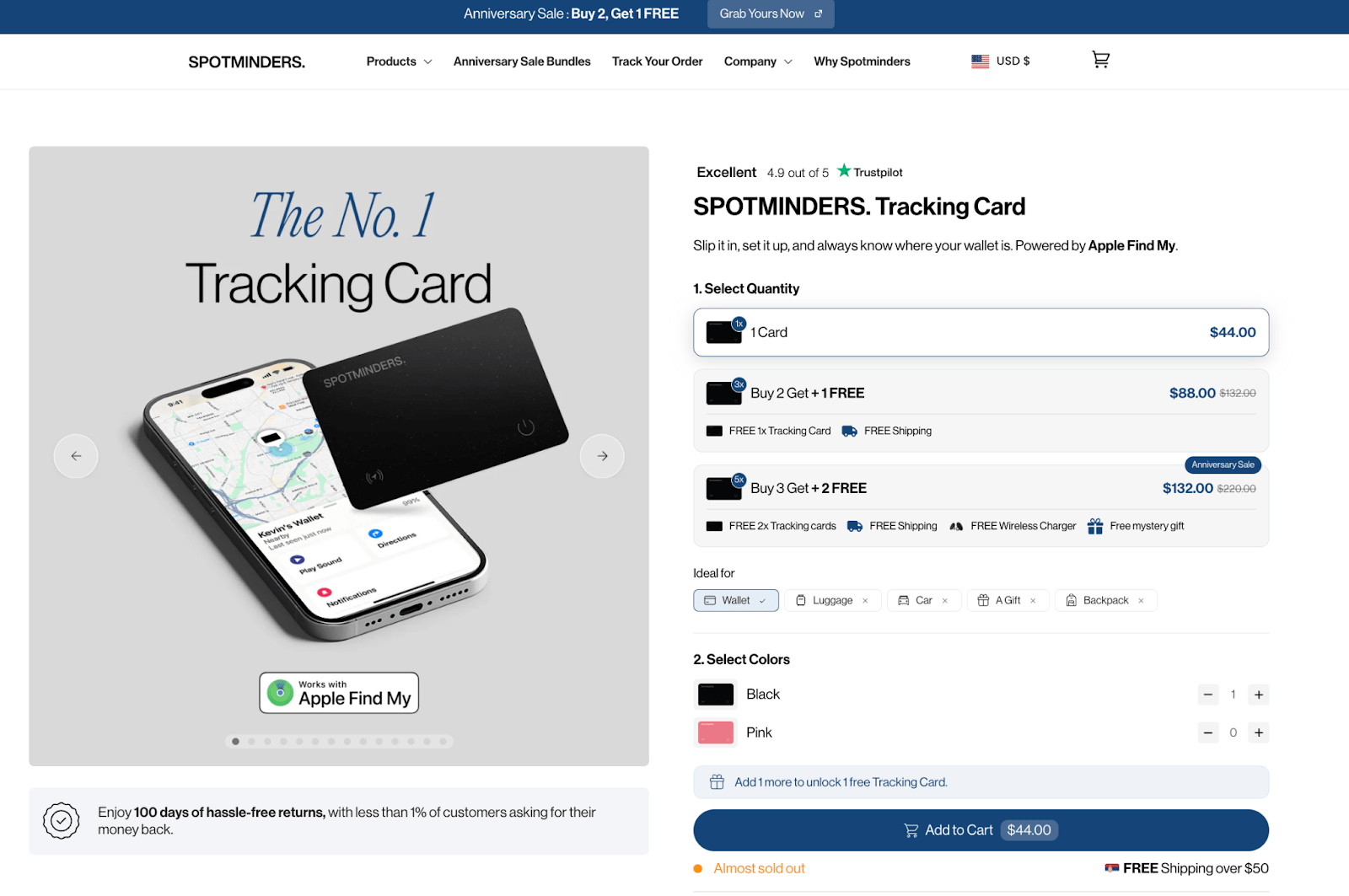
Spotminders, which sells ultra-slim Apple Find My trackers, handles a specific conversion challenge well: the product only has value in a moment of stress, so the page must build confidence before that moment arrives. A three-step setup guide removes the complexity objection early. A direct competitor comparison table keeps researchers engaged. And a 100-day return policy, framed around a sub-1% return rate, turns the safety net into a trust signal. The UX is doing the selling.
Additional trust signals that should be woven into UX include:
- social proof (reviews, ratings, testimonials) placed near decision points
- trust badges and security icons near checkout
- transparent shipping and return information accessible without hunting through the site, and
- progress indicators on multi-step forms that show users how close they are to completion.
Identifying and Eliminating Friction Points
Friction is any point in the user journey where forward momentum slows or stops. It can be technical (a form that won’t submit), navigational (a dead-end page), or psychological (unclear pricing or confusing options).
The most effective way to find friction is not to guess but to observe. Heatmaps reveal where users click versus where you want them to click. Session recordings show where they hesitate, scroll back, or give up. Funnel analytics expose which steps in the purchase process lose the most visitors.
Usability testing is even more direct. Watching five users attempt to complete a core task, finding a product, filling out a contact form, and completing a checkout, typically surfaces the most significant usability problems. These insights are invaluable precisely because they’re based on actual behavior, not assumptions.
Common friction points worth auditing on any landing page or ecommerce site include:
- Checkout processes that require account creation before purchase
- Forms with too many required fields
- Unclear or hidden shipping costs are revealed only at the final step
- Pop-ups that interrupt the purchasing flow
- Inconsistent product page layouts that force relearning
UX Optimization Is a Process, Not a Project
One of the most persistent misconceptions about UX is that it’s a one-time investment — redesign the site, improve conversions, move on. In reality, the highest-converting sites treat UX as a continuous process of testing, learning, and iterating.
A/B testing is among the most reliable tools for this. Testing a single variable at a time, such as a CTA button color, headline copy, hero image, or form length against a control version, produces clear, actionable data. Over the course of dozens of these tests, the cumulative effect on conversion rates can be substantial.
Tracking the right metrics completes the loop. Beyond raw sales numbers, watch:
- conversion rate by page and by traffic source
- average session duration
- scroll depth
- cart abandonment rate and
- return visitor rate.
These metrics tell the story of how users actually experience the site — and where the next optimization opportunity lies.
The Bottom Line: Design Is Your Salesperson
In physical retail, a great salesperson reads the customer, removes obstacles, builds confidence, and guides them naturally toward a decision. On a website, your UX design plays that role — entirely.
Every design decision, from the navigation structure to the color of a CTA button, either moves a visitor closer to conversion or adds another reason to leave. Streamlined UX removes the friction, reduces the noise, and creates a direct path from landing on your page to completing a purchase.
The brands that treat UX as a revenue driver, not just a design concern, consistently outperform their competitors.
Before overhauling an entire site, a simple audit can reveal where UX is quietly costing sales. Start with four questions:
- Can users find any product within two clicks from the homepage?
- Is the primary CTA visible above the fold without scrolling?
- Does the checkout process require more than five steps?
- Does the page load in under three seconds on mobile?
If any of these expose a problem, that’s where to start. Clutter is costing you customers. Clarity is how you win them back.


